Search engine optimisation (SEO) is actually more than just researching keywords and optimising backlinks. When it comes to SEO, you have to consider all the factors that will affect your rankings, including web design in Singapore.
The key is to engage a web design and maintenance agency in Singapore to avoid making common web design mistakes that would harm your SEO. Remember, your website is the front door to your business in this digital time and pace. That is why you should absolutely make the most of it and give your viewers a good first impression.
To ensure that you will not commit web design mistakes, let us look at some deadly web design mistakes that will harm your SEO!
LEARN MORE: OOm’s SEO Services in Singapore
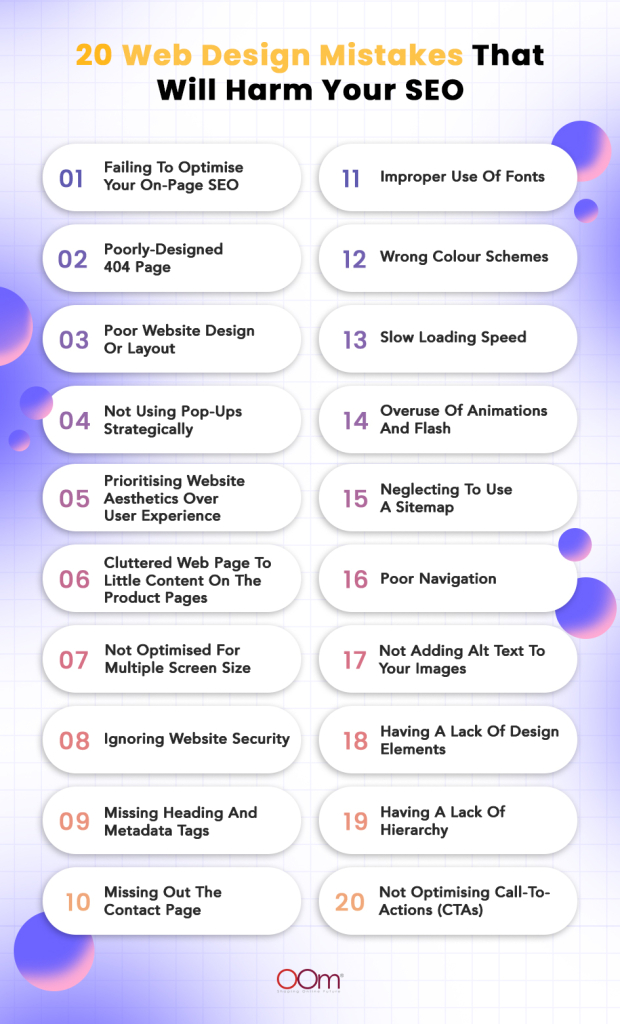
20 Web Design Mistakes That Will Harm Your SEO
1. Failing To Optimise Your On-Page SEO
Also known as on-site SEO, on-page SEO is the practice of optimising various front-end and back-end website elements. Doing so can help you rank well in search engines and earn more organic traffic. This process includes content, meta-tags, titles, links, anchor text, and more.
Search engines use web crawlers, to navigate through websites and analyse their quality of content. Since these crawlers are not human, they cannot judge a website based on its visual appearance. Instead, web crawlers rely on texts to evaluate a site’s SEO.
Remember, on-page SEO is important because it helps search engines understand your website and its content. As much as you can, optimise your website’s on-page SEO to ensure it will get recognised by search engines.
Some good examples you can utilise to step up your game with web design in Singapore are maintaining consistent typography, adding alt text when placing images on a web page, understanding that web design also focuses on technicalities, including social follow and share buttons, and many more.
People are naturally visual learners, so incorporating web design elements such as images, videos, animations, plugins and, most importantly, texts is valuable. Pleasing your web visitors enhances their user experience and increases conversion rate, thus, reducing bounce rate.
FIND MORE TIPS HERE: The Relationship Between Web Design & SEO
2. Poorly-Designed 404 Page
Often called an error page or ‘Page Not Found’ page, a 404 page is a status code that indicates a website user reaches a domain with no information or is an unavailable page.
It can be due to wrong URLs, broken web pages, URLs that no longer exist within the website structure, or when the product is no longer available. Sometimes, 404 pages can also happen if your website is overloaded with traffic.This commonly happens in concert ticket selling due to the hundreds of thousands of fans flocking up to get their own passes.
Below is a good example. Taylor Swift fans lined up at Ticketmaster. However, due to the surge in traffic, the website ended up crashing.

When this happens, the web design strategy in Singapore you can use is to redirect them to another page on your website through buttons. That way, they will not resort to leaving the site.
Look at this one from MAC Cosmetics. Instead of just leaving their customers hanging on this 404 page, they left a question and, at the same time, provided suggestions with hyperlinks below. MAC Cosmetics decided to redirect them to their most popular web pages: SHOP BEST SELLING, SPECIAL OFFERS, and CONTACT US.
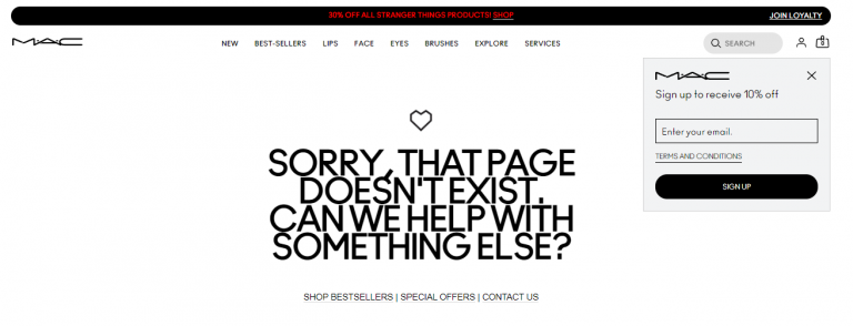
Additionally, MAC Cosmetics also added a pop-up that urges users to sign up and subscribe to their newsletter for a 10% off discount!
Here is another innovative 404 page. When you look for a product already unlisted or not available anymore by Jack Daniel’s, the brand will direct you to this guessing game page. Their strategy is to keep their consumers and website visitors entertained.
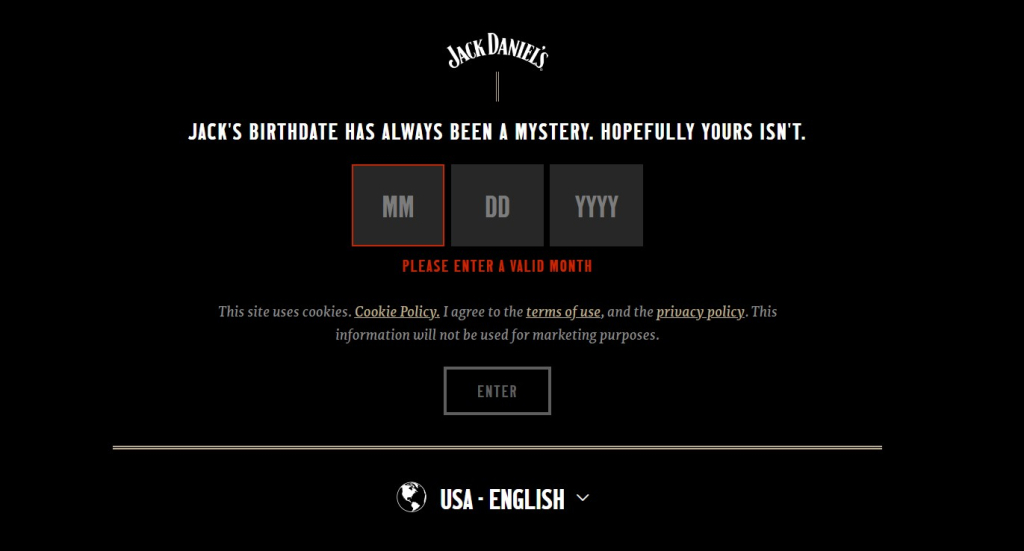
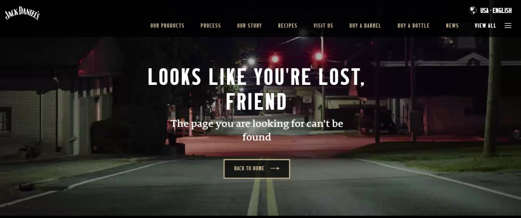
Once you successfully guess Jack’s birthdate, the website will lead you to another page that redirects you to their home page.
3. Poor Website Design Or Layout
Having a greatly designed website layout can be your ultimate secret to success in SEO. The essence of planning and strategising your layout properly can bring benefits to your company and website.
A well-functional, greatly-designed web design in Singapore is one of the key factors that could influence your website visitors to be your customer. Organise your content, and plan your layout. These can eventually urge users to complete a conversion goal. You can drive them to take action on your website. Be it signing up for a newsletter, adding a product to their cart, booking a service, enquiring, or buying an item from your store.
A poorly-designed layout often results in users getting stuck in a loop where they cannot make sense of your content. And this only means one thing—they will not be coming back.
What makes a layout poorly designed? This can include a chaotic template, missing grid, lack of contrast, unpleasant colour scheme, inconsistent style, and many more. Lack of design and layout elements can also be a major factor.
DISCOVER: How To Design A Quality Website For Your Business?
4. Not Using Pop-Ups Strategically
From the name itself, a website pop-up is a window that pops up randomly in the user interface, even without the user taking intentional actions. They have become crucial tools for digital marketing.
Incorporating pop-up ads is one of the strategies website owners can take advantage of so they can influence users and visitors to take action. You can drive them to sign up for discount promos, register for exclusive access to the latest drops, get membership perks, and the like. The key here, though, is to design your pop-up well to get the actions and results you want.
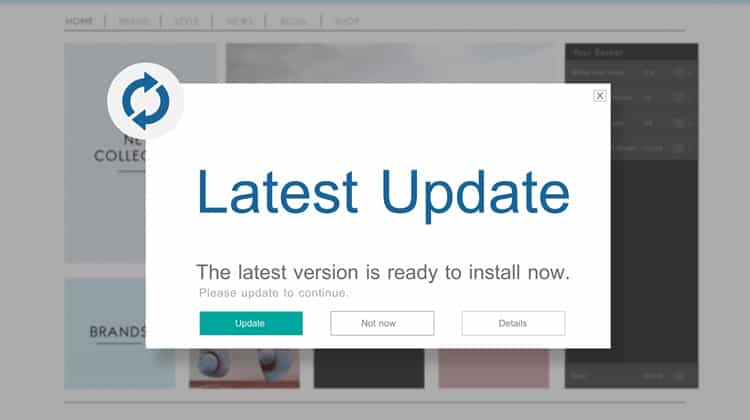
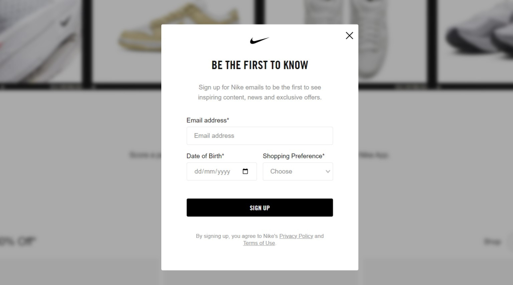
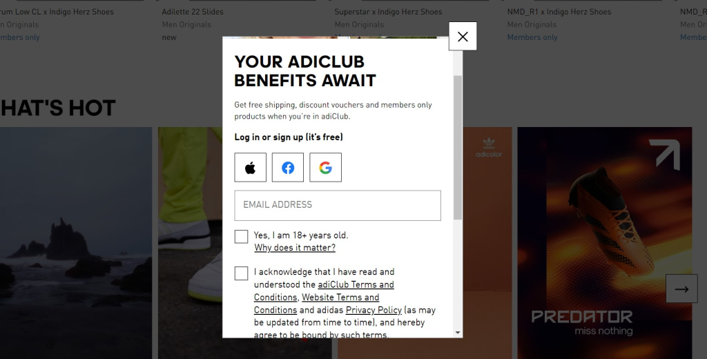
Pop-ups can help you drive conversions and increase your customer base. According to OptiMonk, newsletter promotion pop-ups have a 5.10% conversion rate.
Some good examples of newsletter promotion pop-ups are these two leading athletic brands—Nike and Adidas.
If your business is in line with e-commerce, you can also consider pop-up ads that prompt them to shop like how Sephora did it.

Pop-ups are perfect for online stores. You could show a pop-up to first time-visitors and encourage them to sign up for a subscription. Doing so should help you grow an email list, allowing you to send updates and ads to subscribers.
5. Prioritising Website Aesthetics Over User Experience
While the aesthetic of the website’s appearance, the logo, the colour scheme, the typography is essential to align your branding, the functionality of the website still takes precedence when it comes to a well developed website for search engines and users. Part of web design in Singapore is ensuring your visitors get the best browsing experience. If you do the opposite, it may push them away, and they may find another website to check out. Here is the key—you should maximise and balance between designing a website with a good user experience as well as a good interface.
KNOW MORE: How Does User Experience (UX) Affect SEO?
6. Cluttered Web Page To Little Content On The Product Pages
Showing off everything you have seems like a fantastic plan, for sure. However, when a website is stacked to the brim with pop-up ads, graphics, images, texts, and others, everyone might find it confusing at a glance.
Here is the catch. 38% of people will immediately and undoubtedly leave a website if they feel it is too cluttered or unattractive, according to HubSpot.
Visitors to websites may become disoriented and become unable to identify specific information due to the abundance of information presented in front of them.
Look at this image as an example. Even if it contains every detail that a potential reader needs to know, navigating the entire website can be challenging and overwhelming due to cluttered web design and plenty of pop-up ads.

Website visitors will find this too cluttered and chaotic. Too little content, and you put your brand at stake and not be able to deliver what the user wants. Havinghaving little content on the product pages can also be a bad thing. If you were a potential customer, would you consider purchasing from an ecommerce website that has very little information about the product?
When writing product information, you should include all the details from size, materials, quantity available, and colours. Consider adding product images from different angles so the buyers can visualise it before purchasing.
7. Not Optimised For Multiple Screen Size
Another web design mistake that will harm your SEO in Singapore is not considering its mobile friendliness. After all, users nowadays access the internet from multiple devices with different screen sizes.
Statista revealed that the number of mobile users in the 1st quarter of 2023 reached around 58.33% of global website traffic. This only means one thing—your website visitors expect to experience a mobile-friendly, quality design.Your website should not only look appealing on web browsers but also on mobile.
Prevent that from happening by making the web design of your website responsive. Ensure that whatever mobile devices your potential customers are using to browse through your web pages, they can see everything as clear and readable as possible.
Work with your web design team in Singapore to plan a well-designed website layout for smaller screen sizes that are not limited to mobile phones but can be viewed beautifully on tablets as well.
ALSO READ: Mobile SEO: A Guide To Optimising Your Website For Mobile Phones
Here’s an example of a website that’s optimised for both desktop and mobile. Pipsnacks did not sacrifice its visuals. Be it desktop or smaller screens. What you see on the website is what you see on your mobile phone.


8. Ignoring Website Security
Website security is crucial, much like web design in Singapore. Potential customers would not feel comfortable visiting your e-commerce website, no matter how aesthetically appealing it is if it has little to no security.
After all, online buyers will share personal information such as their names, addresses, and contact numbers when shopping online. They will not share any of these if they have deemed an e-commerce website where they plan to purchase does not guarantee data security.
Not only is this web design in Singapore very important for e-commerce sites but also for banking websites. You would not want to entrust your savings with a website that lacks security, right?
Here are some tips to strengthen the security of your website.
-
- Add privacy policy
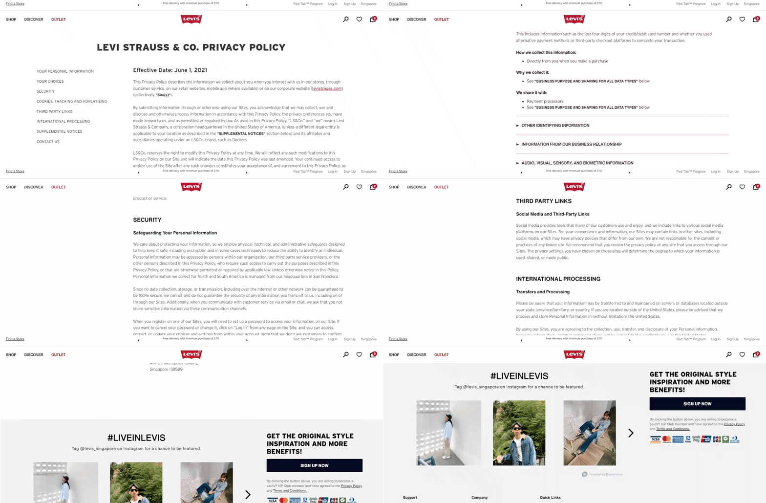
- Add privacy policy
-
- Invest in an SSL certificate

- Invest in an SSL certificate
- Include a two-factor authentication process

9. Missing Heading And Metadata Tags
When creating a web design in Singapore for your website, you should never miss adding the heading and metadata tags. Meta tags include title tags and meta descriptions. These two factors help search engines like Google understand the content structure of a website better.
Metas are relevant for search engine results. These texts are the first thing people read when they search for something on a search engine. That is why you should keep your meta tags as brief, enticing, and descriptive as possible. Of course, with the use of essential keywords!
ALSO READ: A Beginner’s Guide To Writing Compelling Meta Tags

This image shows the examples of metadata tags.
Here are some examples of how you can add headings and show hierarchy.
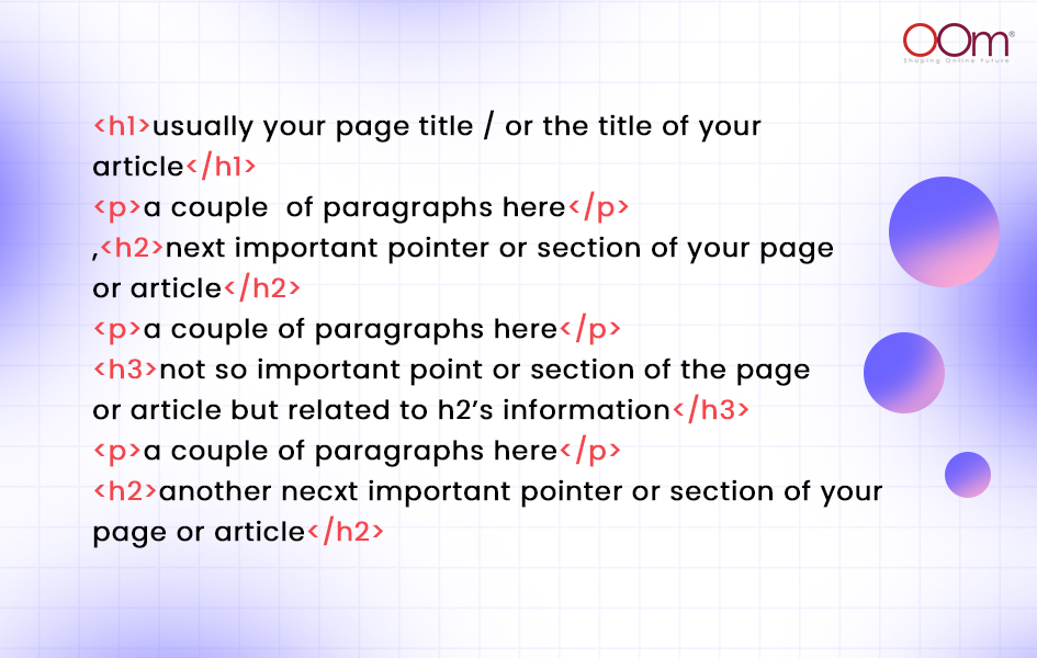
Here are the exact words that John Mueller, Webmaster Trends Analyst at Google, has said during the 2019 Google Webmaster Hangout.

10. Missing Out The Contact Page
One common web design in Singapore is a lack of contact information. You need to add a contact page to get more leads and conversions. Instead of persuading them to take action, your potential customers might visit your competitors as they are unable to find a way to contact you. Guests enquire and reach out to learn more about your products or services apart from the information you have shared on your website.
Tip: Include all your brand’s contact information—social media channels, phone numbers, and business email addresses, and anywhere else they can send you a message.

You can also add social sharing links to your footer like how Urban Outfitters did it.
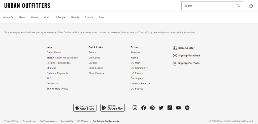
Social media share and follow buttons allow your visitors to be able to find and follow you on various social channels with no hassle! Through this tactic, you have a better chance of reaching out to clients and increasing brand awareness.
11. Improper Use Of Fonts
A good web design in Singapore uses appropriate font size and type. After all, using too many different fonts does more than good, especially for SEO. Try to read the text in the image below.
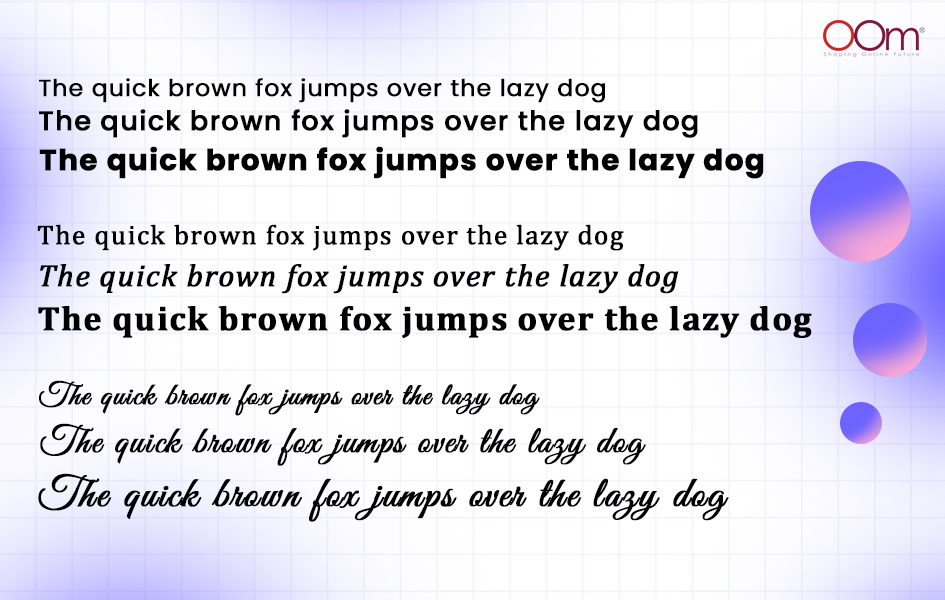
Using a combination of different sorts and sizes of fonts on your web design is a sign of bad typography. All of them fight for attention. People visiting your website might get confused about which part they should read first. They may even perceive your platform as not reliable due to the improper use of fonts.
ALSO READ: Design Showcase: Typography In Web Design
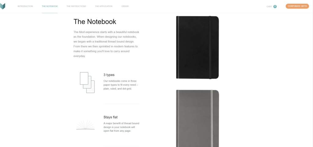
When enhancing your typography, consider using fonts with distinguishable letters and avoid more than three different types. Check out these two sites with good typography.

12. Wrong Colour Schemes
While bad typography is a major red flag in the website’s web design, so is the improper use of fonts. Many business owners also choose the wrong colour schemes for their websites. Instead of becoming aesthetically pleasing, their website looks terrible because they choose the wrong colour combination.
RELATED: The Importance Of Colour Theory For Digital Marketing
If your website has terrible colour schemes, you can expect it will irk your visitors to the point they become triggered to leave. Be kind to your website visitors, and use colours that are very easygoing. Try maximising two to three primary colours on the web design of your website.
DIVE DEEPER INTO: Design Showcase: Colour Psychology and Brand Marketing
13. Slow Loading Speed
Another thing you need to consider when designing your website is the loading speed. Did you know that this factor does not only affect your web design but also your website rankings?
RELATED: 7 Steps on Speeding Up Your Website’s Performance
Even if it has all the essential elements that a website needs, if it takes longer than three seconds to load, you can expect your visitors to leave and find another similar e-commerce website that offers the same thing.

(Source: Facebook/MI Academy)
Try using PageSpeed Insight, Pingdom Tool, and GTmetrix to test the performance of your website before it goes live and becomes accessible to the public.
14. Overuse Of Animations And Flash
Even though using animation and flash was a hit 15 to 20 years ago, this web design strategy in Singapore is no longer a trend. Wave your hands goodbye to it.
Using animations or flash on your website slows down the loading speed.Remember that the shorter the visit duration of visitors, the higher the bounce rate will become—indirectly hurting your SEO.
15. Neglecting To Use A Sitemap
To guarantee your visitors will not get lost when navigating through the web pages of your website, you should use a sitemap. It is a directory of websites that provides directions for anyone to their preferred location.
Here is an example of a sitemap from PRADA to give you an idea of what a sitemap should look like on a website.

Ensure your sitemap is well-organised, showcasing your products or services by categories and subcategories. It will help visitors find the product they are looking for easily. Search engine crawlers can also efficiently index the web pages and show them to relevant users on SERPs.
16. Poor Navigation
One ground rule with web design in Singapore is to keep your navigation as simple as possible. Website visitors tend to leave pages when they immediately encounter complex navigation. Hence, this leads to a higher bounce rate.
What makes navigation complicated? This includes having the menu in a peculiar place, multiple submenus, a complex drop-down list, generic labelling, lack of description, and non-standard style.
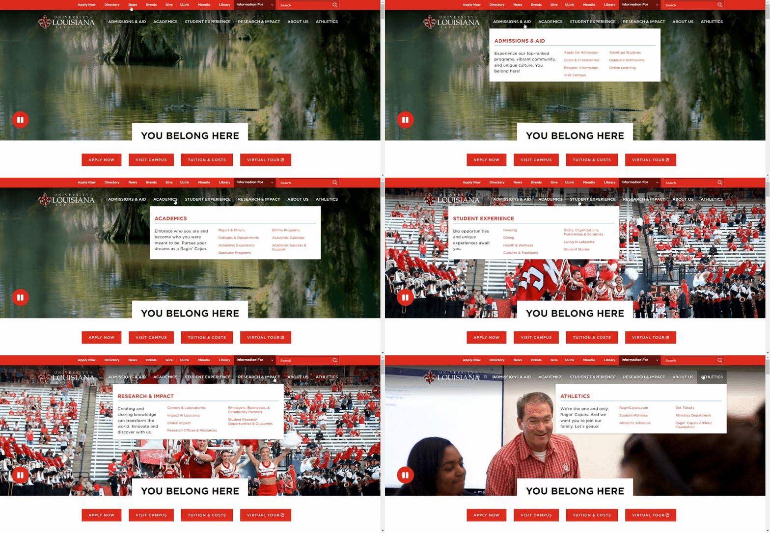
Below is one example. The University of Louisiana offers a wide variety of programmes and resources, which you can find on its drop-down navigation menu.

(Source: HubSpot)
However, the issue here is the lack of spacing between each label and the colours used, which is alike to the header background. Thankfully, they learned of this mistake and upgraded its appearance.
17. Not Adding Alt Text To Your Images
Did you know 65% of people are visual learners? According to a study, humans rely heavily on visuals, including videos, animations, plugins, texts, and most importantly, images.
RELATED: 4 Tips For Optimising Your Images
Half of the population of site visitors actually use and depend on image alt text. What is it for? Alt texts help describe what the image shows or the graphic conveys. If you do not add alt text or do not adequately describe the image, you are separating readers who need it to examine your site.
Images are important design elements of your website’s content. Ensure to write alt texts that briefly convey what the image on your page displays. Keep it short and sweet.
18. Having A Lack Of Design Elements
One of the biggest web design mistakes anyone can make is not incorporating enough design elements. Think of images, good colours and colour palettes, text content, various clickable buttons, icons, forms, and the overall general layout itself.
Undoubtedly, a good web design in Singapore can be your secret to attracting a massive amount of audience, locally and globally, in a short time.
Start with making your text content readable and pleasing to the eyes. Use headings to separate each section. Utilise beautiful elements and decorations. Think of strokes, circles, dots, ticks, and sticks.
RELATED: 8 Elements Of A Good Web Design
Here is one good example of a well-laid-out visual noise from Appraisd.
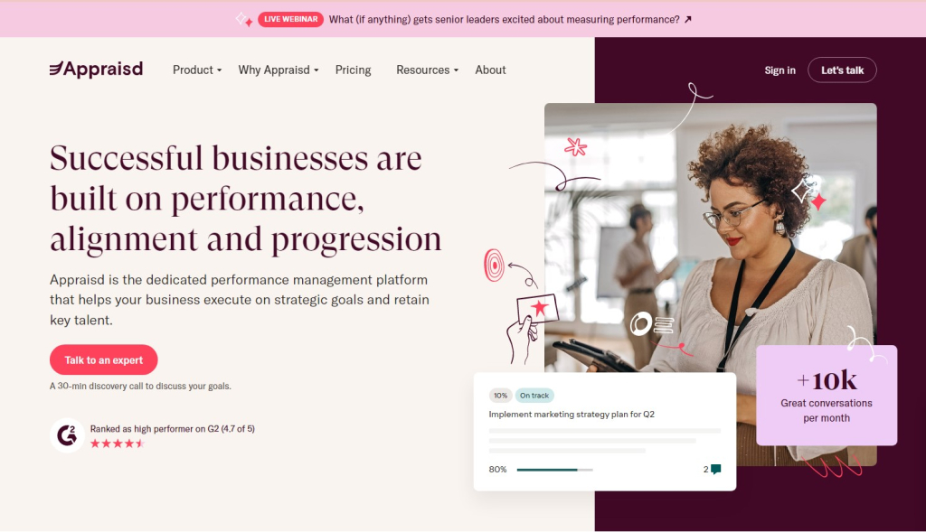
As you can see, they used flowers, spirals, charts, and others. On top of that, they properly used different font styles and sizes to emphasise their website’s main section and slogan.
19. Having A Lack Of Hierarchy
Visual hierarchy is crucial in web design in Singapore. This factor helps website visitors know where to focus their attention. Being organised does not only add plus points to your website’s overall aesthetic appeal. It also helps make it more functional, giving it a cohesive structure.
When you use visual hierarchy properly, you push your users and website viewers to take clear actions and have a seamless experience. On the contrary, the lack of hierarchy can mislead them and prevent them from achieving their primary goals.
The golden rule to a good visual hierarchy is that the user should be able to differentiate each element on your website. Check out the photo below.
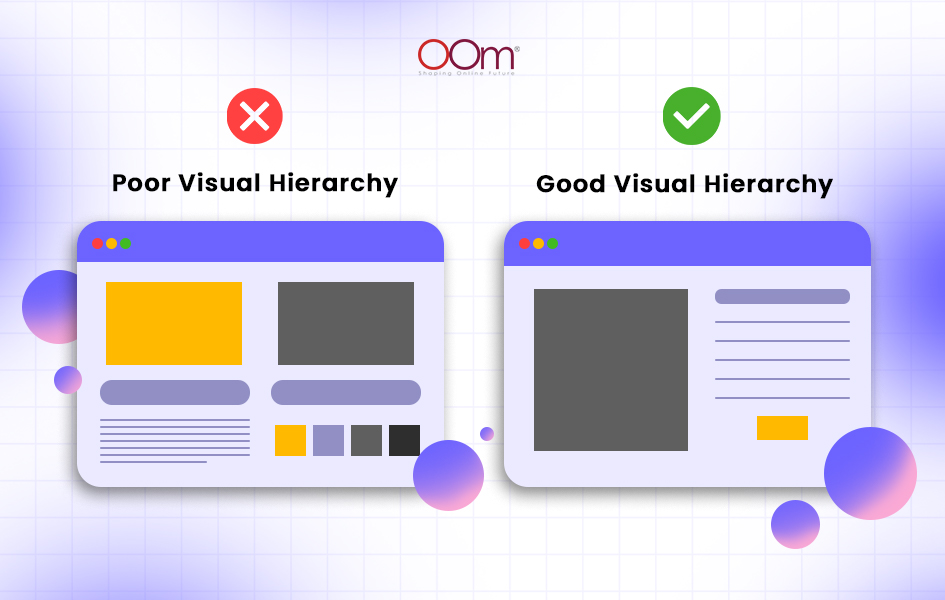
On the left part, there are too many elements. Although the main content is of the same size, they have different colours. This web design mistake will only make users struggle with drawing their attention.
On the right side, website visitors can automatically know which area to look at. What makes it even better is the orange button below the text that can serve as a CTA.
20. Not Optimising Call-To-Actions (CTAs)
Writing persuasive content is not enough to nudge customers to take action. That is where the call to action (CTA) would come in. You may often see these as ‘Buy Now’, Start Trial, ‘Work With Us Now’, etc. Despite how brief the words that come after persuasive content, they can motivate the readers to do something.
However, proper placement of CTA is still key. As much as possible, you should ensure it compliments well with the web design to prompt the readers to click on it.
ALSO READ: 4 Tips For Making An Effective Call To Action
Wrapping Up!
With the right SEO agency in Singapore, a well-planned web design strategy, and an effective SEO campaign, you surely will achieve success in the industry and reap more benefits, such as driving traffic and making sales.
Consider partnering with a web design agency in Singapore like OOm! Contact OOm at +65 6690 4049 or leave a message on our website if you are interested in our website design services.


