
Building a brand starts with creating a company logo. A logo is the best way to establish your brand’s identity. Logos aim to create an impact to your customers and ensuring that they will remember your brand, products, and services. Basically, a logo is important for a company to make it standout and known among the others. But no matter how creative a logo is, it wouldn’t be effective if it will not become recognizable.
To achieve a well-designed logo, one has to be updated with the latest trends in design as it’s a real hard work keeping up with what the audience is attracted to these days. Most logos nowadays are communicating through ideas that represents the types of services they offer.
Here are some of the most iconic company logos of all time. These brands have strongly established their brand personality through their logos. Let’s take a closer look as to how these company logos have started and what made it stand out among the rest.
Starbucks
The famous coffee siren may have been around since 1971, but the famous Starbucks logo have been to a series of revision before it has become what it is today. It has undergone three changes which includes changing the color and further emphasizing the siren as the logo.

You may be wondering what does the siren means. Well, in Greek mythology, mermaids lure sailors to shipwreck off the coast in an island in the South Pacific. That island is sometimes referred to as “Starbuck Island.” So, that’s how they get their iconic symbol.
McDonald’s
Oh, the golden arches. Everyone around the world can recognise the McDonald’s logo even with their eyes closed. It’s a simple architectural design in the early years of their store, but during that time their logo was a simple “McDonald’s Hamburgers” in black and white. Since the arches have become popular, they incorporated the arches into their branding in the 1960s.

Since then, the company never changed their logo design. It can be said that it’s one of the longest running original company logo there ever is. Well, how else could you have revise two golden arches? It works and it’s effective. To make their logo a bit trendy, though, they just rearrange the layout and add a tagline. Other than that, it’s all the same.
Apple

One of the most prominent, and recognizable logos around the world is Apple’s. Their logo represents elegance and class; equally as how they want to represent their products. Many have been wondering about the meaning of the bite on the Apple logo. Speculation have been made that it basically means taking a bite out of Apple, but Rob Janoff claims that the bite is just for scale so it will show the shape was an apple and not a cherry or any other round fruit.
FedEx
In design textbooks, FedEx’s logo is used as a reference to describe a simple yet effective logo. Also, it brings character such toughness and thoroughness in a minimal design.

Designed in 1994 by Linden Leader & Landor Associates, the logo actually has a hidden arrow between the “E” and “x” which is a subliminal symbol for speed and precision.

Nike
Who would have thought that the popular Nike swoosh was created by a student? That’s right. In 1971, Carolyn Davidson created the iconic logo and got paid $35. But don’t be sad about her. She was rewarded with Nike products after a decade that the logo became a hit.

The logo has also gone through a series of revisions in the last decades, but the classic swoosh remained. Nike is strong in keeping the company’s logo simple and fluid, that it can easily convey their credo: flight, speed, and victory.
Mercedes Benz

As the face of luxury cars, Mercedes-Benz needs to have a company logo that will go with their profile, and they pulled it off. There are some logos that doesn’t need the company name to be recognized, and theirs is one of those. Their triangle star represents the automaker’s drive in universal motorization using engines dominating the land, sea, and air.
Coca-Cola

They are their own brand, that’s why a simple personalized script font is already enough to keep the brand known. But those white curly waves have been incorporated to the company’s logo since the beginning but have had a series of variations, which only made the brand logo stronger and more effective.
Sony Vaio

It’s a smart design that a common eye wouldn’t really notice. Well, at a glance, it’s just looks like a simple play with the word “vaio” in cursive stroke. But once you take a look at it, it actually represents the transition from analog to digital. Clever, right?

But wait, there’s more!
Those are just some of the well-known popular logos of popular brands. Look through some of the logos below – both from popular and new brands – and click each to know more about them.
Chanel

Mickey Mouse

Goodyear

Audi

Volkswagen
Adidas


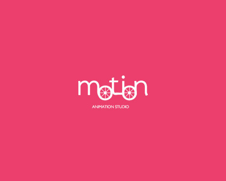
Motion Animation Studio
My Indian Closet

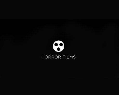
Horror Films
Killed Productions
Milky Mug
Iconic logos don’t grow on trees. You can’t just throw in some creative concept and draw some lines to make a good design. It has to be carefully designed that it describes what you do as a company.
Focusing on branding is a smart way to build not just your reputation but also to attract links! Connect with us today if you want to find out more about the relationship between SEO and branding.


