The way certain colors and designs are made actually has a very deep impact for user experience and therefore helps in boosting the overall performance of a site.
If you have that dream of making it big in your industry and you have the content and all the necessary ingredients to share, but don’t have the visual feel to grab the hearts of your audience, it will always anchor your performance down.
The last few years has been a revolution when it comes to design. Most especially with the Retro ones that are having a comeback. At this point, I think everyone has seen Stranger Things. The show isn’t really the first thing that has a story that happens on another timeline, but because this particular one is so popular, it send almost everyone on this 80’s type of trip that makes you reminisce. And it let the new generation get to experience what it was like in the 80’s.
We’ve once before checked out the different kinds of colours that can help your performance online. And when it comes to vintage design, there can be a combination of these contrasting colours. There was a time before that mono chromatic types of colour combinations were the current fad. Though sometimes it is an actual necessity. But some of the more exciting types of sites out there today have vintage written all over them.
From 80’s synth pop graphics

to 70’s crazy fonts.

There are also other examples just outside of SEO’s user experience optimization. But this definitely is beneficial when it comes to business in general. Let’s say for example, in the automotive industry.
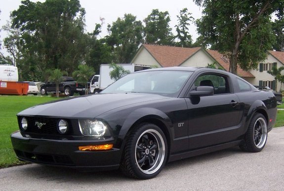
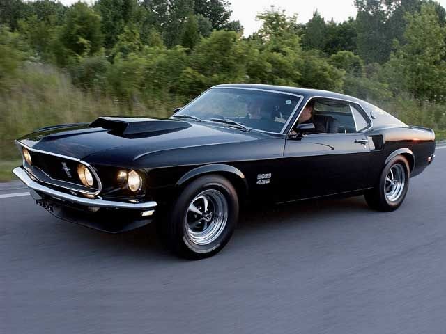
In 2005, Ford unveiled its newest iteration of one of their most successful models, the Mustang. And instead of it being designed as a modernized sleek and boring modern car, they redesigned the whole vehicle and gave it design features that is absolutely reminiscent of the whole muscle car era from the late 60’s and Early 70’s.
What was the result? All the other car companies soon followed that trend and are all still at it even today.


And again, not to open up a closed wound, if you see your competitors panicking, you know you’re doing something right.
Next is on educational videos of YouTube.
Vsauce 3’s Jake Roper has been filming videos with that vintage vibe for years. To the point that today, other YouTubers have been following his footsteps.
Now you might think, wait, isn’t the vintage thing an oldies type of fad? And besides, we’re targeting the young people now. People on phones all the time and are always on the go. That’s correct. But don’t forget about the popular media that’s being fed to the public today. If they all think that the 80’s are cool because of Stranger Things for example, if popular singers and bands and movies have vintage elements to it, then the whole culture of this market will get influenced. The whole taste of the public can change because of popular media.

Again, it doesn’t mean that this will go with every type of website and industry. To make sure your identity and brand is clear, you first need to make sure that you use the correct types of vibe, colours and design.
If your business is in a serious kind of industry it’s better that you use proper professional colours and design. Though utilizing exciting types of colour and design will help your website stand out, it is actually very risky that you try to use colourful and wild designs. Let’s say for example, you are running a Police website. Or the government’s website. It’s always better to not cloud it with entertaining graphics and design. In this case it’s very important that you keep the site and therefore the brand, professional looking.
If you’re a design company, you should go all out.
This is an opportunity for you to show your skills. And since you’re a design company, giving your site an exciting type of design can actually help you get more customers or clients online. This will become your portfolio. Something you can show your would be clients.
And all this can give your audience the type of feel and excitement when they see “cool” vintage designs.