It has been seven years since Google released the ‘Mobilegeddon’ (a term used to describe Google’s massive mobile-friendly update in 2015), but its importance for SEO remains the same. You need to improve your website’s performance and website design in Singapore for mobile devices to rank higher on Google.
Ever since Google made it crucial to optimise your website and content for mobile devices, website design has become an even more vital part of SEO and digital marketing. Your website should be well-optimised for search engines across different devices, mainly computers and phones.
There are many different approaches to designing a website, and some of them will boil down to two options: responsive design and adaptive design.
THE DIFFERENCE BETWEEN RESPONSIVE AND ADAPTIVE WEBSITE DESIGN
Responsive website design in Singapore focuses on developing a website to make it suitable for a user’s device. The goal is to create a versatile website that will fit any size and orientation. With a responsive website, the layout, design elements, and content will appear on the user’s device depending on the device it is viewed on, such as laptops, tablets, and smartphones and the device’s screen size and browser window..
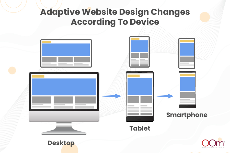
As for adaptive website design, the approach is slightly different. Instead of making a single website that responds to any screen size, you will design multiple versions of layout sizes for various devices. Your website will detect the device and choose the most appropriate version of itself to provide the user with the most optimal experience.
Both website design approaches react and adapt to the given environment. Factors such as the height and width of a user’s browser will affect the outcome of your responsive or adaptive website design strategy.
KNOW MORE: Web Design in Singapore: How Does It Affect SEO?
The difference between responsive and adaptive website design is that both take a slightly different approach. Responsive website design is more fluid, while adaptive website design is less flexible and more snappy.
Responsive website design may seem like a better choice, but adaptive website design also offers a few benefits. If you have to stick to only one website design approach, which one should you choose: responsive or adaptive website design? Let’s take a look at some of the pros and cons first.
READ: Website Design & Development 101: All the Basics You Need To Know
RESPONSIVE WEBSITE DESIGN: PROS AND CONS
Responsive Website Design
| ADVANTAGE | DISADVANTAGE |
|---|---|
 Easier, More Affordable, and SEO-Friendly
 |
 Inaccessible Pages Inaccessible Pages |
|
Low Maintenance |
More Complex and Time-Consuming To Develop |
|
Increased Profit |
It Takes Time To Download |

PRO: EASIER, MORE AFFORDABLE, AND SEO-FRIENDLY
Compared to adaptive website design, responsive website design in Singapore is much easier and more affordable. With a wide variety of cheap templates like WordPress and Joomla, you have so many options that will fit right into your budget range.
Furthermore, responsive website design is more fluid and flexible than adaptive website design. Your website will transition from one page to another more smoothly on any device, thus guaranteeing users an optimal viewing experience.
Most importantly, responsive website design is SEO-friendly. Your website can load much faster and provide users with more usability, both of which will affect your SEO rankings.
PRO: LOW MAINTENANCE
There are little to no changes to be made on responsive websites just to fit them on the device’s screen because the content and website layout automatically adjust across all devices.
Furthermore, a website design company only maintains one website instead of two or more dedicated to fit various devices. Therefore, it only means that maintenance and troubleshooting will be more efficient.
PRO: INCREASED PROFIT
It has been established that responsive websites are much more affordable. It also requires less upkeep, which saves money as well. But what increases your profit is the increased traffic and user experience of a responsive website design in Singapore.
As mentioned, responsive websites are SEO-friendly because of their crawlability. Search engines like Google release bots or crawlers to the HTML content of your website. Each URL for different devices of a responsive website uses the same HTML, unlike Non-responsive websites that use different HTML for various devices. It makes assigning indexing properties to the page more accurate and efficient.
Search engines analyse the user’s device when it comes to queries. For instance, if a user accesses Google using a smartphone, Google ensures the websites that will appear on SERP are all optimised for smartphones. Responsive websites get the best of both worlds– mobile devices and desktops.
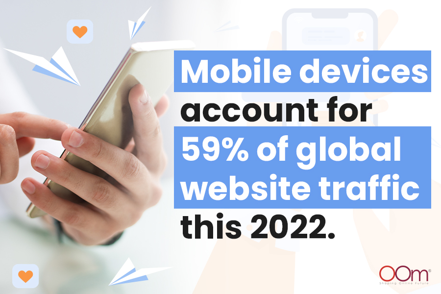
Website visibility and traffic increase, and the business now has more chances to convert the traffic to sales. One of the keys to increasing conversion is improving user experience. In fact, 73.1% of website designers and developers think that non-responsive website design is the primary reason people leave a website. Having a mobile-optimised website is crucial at this age, especially since approximately 59% of global website traffic is from mobile devices. Thankfully, a website design agency in Singapore can help you implement responsive website design.
RELATED: 7 Reasons Every Small Business Needs A Website
CON: INACCESSIBLE PAGES
The downside of an e-commerce responsive website design is that there is a chance some of your web pages are inaccessible for some users. This problem usually occurs if the website is not well-optimised. As a result, you may have to scale down some of your website components to ensure each web page is accessible for users.
CON: MORE COMPLEX AND TIME-CONSUMING TO DEVELOP
Although maintenance is easy, developing a responsive design can be quite complex. A website design company in Singapore needs to create at least three website design versions dedicated to desktop, tablets, and smartphones because not all elements in the desktop version cannot be catered to mobile devices.
For example, mobile versions may displace some navigation and CTA buttons present in desktop versions because they will not fit in the mobile devices’ screen sizes.
CON: IT TAKES TIME TO DOWNLOAD
The downside of a responsive website design is it does not necessarily reduce the file size of the website design elements for specific devices. Responsive website design does change the dimensions of the website proportionately but not the file sizes of high-resolution images, videos, and more, requiring more time for your website to load on your device. This drawback is something website design services in Singapore should work on.
ADAPTIVE WEBSITE DESIGN: PROS AND CONS
Adaptive Website Design
| ADVANTAGE | DISADVANTAGE |
|---|---|
|
Fast Loading Times And A Better User-Experience |
Expensive And Complex |
|
Caters To Lower-End Devices |
Labour-Intensive |
|
Optimised For Advertising |
High Maintenance |

PRO: FAST LOADING TIMES AND A BETTER USER-EXPERIENCE
While responsive website design offers more fluid movements and transitions, adaptive website design aims to provide users with the best experience possible. You can fine-tune your website for different devices to ensure users will experience the most optimal version of your website.
Also, adaptive website design works best for websites that cater to specific audiences. For instance, if you want to target mobile users, try creating a high-quality website specifically for mobile devices to give your audience a unique web experience.
PRO: CATERS TO LOWER-END DEVICES
One of the advantages of adaptive website design in Singapore is it accommodates lower-end devices. Although many use smartphones today, some people still use feature phones or phones with internet capabilities but are not considered smartphones.
The inclusivity becomes vital if the brand is targeting developing markets where feature phones are still significant in the number of users. It also increases the user experience of lower-end device users. You might want to consider adaptive website design during your website development if you need this advantage.
PRO: OPTIMISED FOR ADVERTISING
If you want to monetise your website, the top website design in Singapore would be adaptive. Website designers and developers can optimise advertisements efficiently because there is already a smaller website design version available. Unlike in responsive design, designers need to reduce the advertisement banner size and resolution in order to load fast on mobile devices.
CON: EXPENSIVE AND COMPLEX
Adaptive website design comes at a high cost. You might have to consider hiring a team of website designers who specialise in adaptive website design since it is more challenging and demanding than responsive website design.
CON: LABOUR-INTENSIVE
As mentioned, adaptive website design is complex, so hiring one website designer and website developer in Singapore may not be enough. Adaptive designs need to lay more groundwork than responsive designs.
It is crucial to find a highly skilled website design and development team in Singapore that can create multiple website design layouts optimum for each device. Many designs mean more coding. If you want to finish the task efficiently, you might want to have more people who will work on them.
CON: HIGH MAINTENANCE
Since they are more complicated to create, they are harder to maintain as well. One reason is you conserve the upkeep of multiple website designs simultaneously. These versions need to be updated regularly as well.
You may need a professional and highly skilled website design company to do this task. It is an obstacle for small businesses with limited resources because these services tend to be expensive.
WHICH ONE IS BETTER: RESPONSIVE OR ADAPTIVE WEBSITE DESIGN?
When it comes to SEO and digital marketing, both website design strategies have unique pros and cons. No option is better than the other. The better choice will depend on many factors, such as your goals, budget, and needs.
Responsive website design in Singapore is an excellent choice if you prefer the most convenient way of designing a website. On the other hand, adaptive website design is perfect if you want to create a website for specific devices. Consider both pros and cons, then decide which one is perfect for your website and digital marketing campaign based on your objectives and preferences.
LEARN MORE: What’s Hot: Web Design Trends You Should Look Out For This 2022
Conclusion
Regardless of your choice, make sure your website is SEO-friendly. Design a user-friendly website for search engines to rank higher on Google. Contact a digital marketing agency in Singapore if you need help in optimising your website design in Singapore for SEO.
Contact our SEO agency in Singapore at 6391-0930 for more tips and tricks.


