Over the years, many brands have gone through significant changes. Part of these changes is the major overhaul of particular brand logos.
Logos are one of the vital elements of brand identity and content marketing in Singapore. By designing a timeless logo, your brand can stand out and look remarkable in the following years to come.
Brand logos also play a significant role in digital marketing, specifically SEO. You can optimise your logo to improve your website’s local search rankings. Without a well-optimised logo for your website, you might lose the potential to attract customers on search engines like Google and Bing.
LEARN MORE: Design Showcase: Iconic Company Logo
The challenging part of designing a logo is to make it look stylish and recognisable. Your brand logo should stand the test of time and convey a clear message, so be creative, think outside the box, and create a strong sense of brand identity.
5 Creative Logo Design Trends For 2021
Revamping your logo is a huge step towards success, but only if you do it the right way. Before you decide to change your logo, you should opt for a stylistic choice that keeps up with modern-day trends.
Here are five creative logo design trends in 2021 that can benefit your digital marketing and rebranding strategy.
1. GEOMETRIC SHAPES
Circles, triangles, squares, and combinations of different shapes are essential elements of a brand logo. Look at Pepsi’s simple brand logo with a colour scheme of blue, red, and white. Pepsi has used the same colours and geometric shape for its brand logo for decades, and it has stood the test of time ever since.
2. SYMMETRY

Symmetry is the balance of two similar parts of an entity or thing. Today, many brands have been using symmetry as the foundation of their rebranding and digital content creation strategy.
McDonald’s logo is a perfect example of how you can use symmetry for rebranding. The famous letter “M” symbol has existed for more than five decades, yet it has only gone through minimal changes.
3. ABSTRACT DESIGN
In contrast to symmetrical shapes and visuals, abstract design is all about choosing a unique aesthetic. Try to maintain a clean image by using fewer elements to get your message across to your viewers more effectively. A simple combination of colours might do the trick and make your digital content creation stand out.
4. SIMPLICITY

Sometimes simplicity works best. In the case of Uber, simplicity worked just fine for its famous brand logo. With only a few changes over the years, Uber has established a consistent brand identity with a simple yet elegant logo. Perhaps you can do the same by choosing the perfect typeface for your brand name and logo.
5. PORTRAITURE
Portraiture is the art of creating portraits, and it applies to graphic design, digital content creation, and rebranding. If you want to add an instantly recognisable face to your brand logo, then portraiture is the perfect style for you. You can connect with your customers more deeply and intimately by creating a highly detailed portrait.
Why Do Brands Redesign Their Logo?
Time will come when your brand logo might need a change in aesthetics. The decision to redesign your logo will depend on how stylish and creative it looks in the present and future.
However, when it comes to digital content creation, trends will always come and go. What might be acceptable and fashionable today could become outdated in just a few years. You have to ensure that your brand logo fits with the changing times.
For instance, countless brands—such as Dunkin’ Donuts, Google Ads, Coca Cola—have revamped their logos. Some of these logos have undergone minimal changes, while others look entirely different. The purpose of brands changing their logos is to update their image and keep up with the modern world.
In Singapore and Malaysia, logo revamps are quite common as well. Here are some examples of logo redesigns from Singaporean and Malaysian brands.
1. JULIE’S BISCUITS
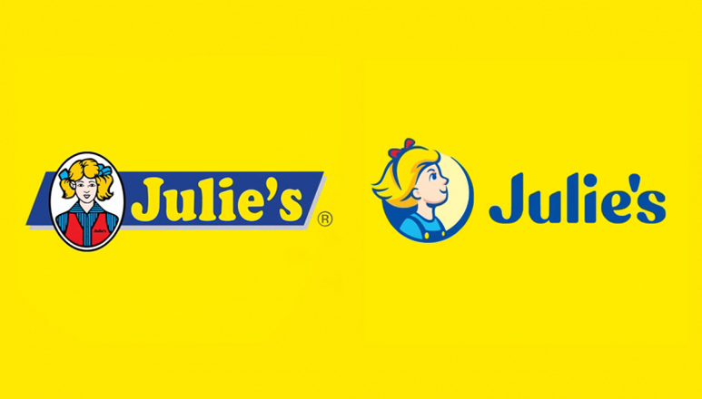
For 35 years, Julie’s Biscuits has stuck with the same brand logo until they decided to change it in 2020. It was a good decision since the famous Malaysian biscuit brand has been around since 1984. With a significant logo revamp, Julie’s Biscuits is now looking more youthful than ever.
2. M1
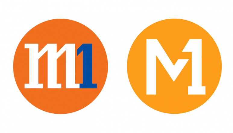
M1, a telecommunications company in Singapore since 1997, redesign its logo in 2020. Consumers have given this logo rebranding mixed reviews. Some appreciated the new look, while others gave it negative reviews, with comments saying that the redesigned logo looks awkward due to the “M” appearing detached from the “1”.
3. GIANT
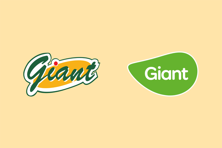
Giant ditched its orange and green colour scheme for something more simple. The striking change in aesthetics and colours have resulted in an almost entirely different brand logo.
Lee Hik Yun, marketing director of Southeast Asia Food at Dairy Farm Group, explained why the company proceeded with its digital content creation strategy. He stated that by changing the colour scheme, the brand logo would associate with green to represent freshness.
Conclusion
Take note of these top five trends if you wish to redesign your logo in the future. Rebranding is a vital part of digital marketing and SEO services, so consider partnering with an SEO agency if you need help.
Contact our SEO agency in Singapore at 6391-0930 for more tips and tricks.


